School students were surveyed on their favourite brand of drink. The results are represented in the pie chart below.
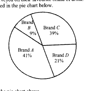
- (a)
State one error in the pie chart above.
Answer ...
- (b)
State one way to correct the error stated in part (a).
Answer ...
It won't just hand you the answer — it asks where you're stuck.How the checker works
Worked solution
3(a)
1. Check the total percentage shown in the pie chart
For a pie chart, all sectors should total .
.
This is impossible for one pie chart.
Answer
The percentages add up to , not .
3(b)
1. State a valid correction to the percentage error
Since the percentages currently add up to , correct the pie chart by adjusting the percentages so that they add up to .
Answer
Change one or more of the percentages so that the total is .
AI analysis — may contain mistakes.
Worked this one out on paper? Snap your steps and Gigle's AI math checker will circle the step where it went wrong.
More questions on this topic
- 1Explain how the line graph above may be misleading. Answer ...
- 2Below is a graph from the Annual Climate Singapore 2023, which shows the top 10 warmest years in Singapore since 1929. S…
- 3A website shows a poster of the poaching statistics of African elephants. Explain how the poster above may be misleading…
- 4The graph shows the number of cyclists in an annual cycling marathon for the years 2017 to 2019. State one aspect of the…
- 5A company presented their 2023 financial report in this graph. State one aspect of the graph that may be misleading and…