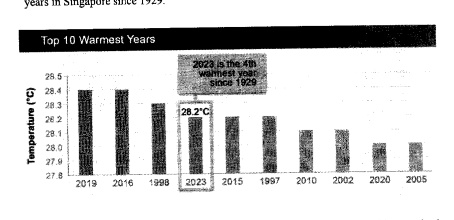
Below is a graph from the Annual Climate Singapore 2023, which shows the top 10 warmest years in Singapore since 1929. State one aspect of the graph that may be misleading and explain how this may lead to a misinterpretation of the graph. ...
It won't just hand you the answer — it asks where you're stuck.How the checker works
Worked solution
5
1. State one misleading aspect of the graph
The -axis is truncated: it begins at about instead of .
2. Explain how this may cause misinterpretation
Because the vertical scale is cut off, small differences such as a few tenths of a degree are visually exaggerated. This may lead readers to think the temperature differences between the years are much larger than they really are.
The vertical axis does not start from ; it starts at about . This makes the differences in bar heights look much larger than the actual temperature differences, so a reader may think some years were much warmer than others when the differences are actually small.
AI analysis — may contain mistakes.
Worked this one out on paper? Snap your steps and Gigle's AI math checker will circle the step where it went wrong.
More questions on this topic
- 1Explain how the line graph above may be misleading. Answer ...
- 2A website shows a poster of the poaching statistics of African elephants. Explain how the poster above may be misleading…
- 3The graph shows the number of cyclists in an annual cycling marathon for the years 2017 to 2019. State one aspect of the…
- 4A company presented their 2023 financial report in this graph. State one aspect of the graph that may be misleading and…
- 5Based on the pie chart shown on the right, Mrs Goh told Mr Goh that male drivers are worse drivers than female drivers.…