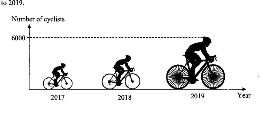
The graph shows the number of cyclists in an annual cycling marathon for the years 2017 to 2019.
- (a)
State one aspect of the graph that may be misleading.
- (b)
Explain how this may lead to a misinterpretation of the graph.
It won't just hand you the answer — it asks where you're stuck.How the checker works
Worked solution
3(a)
1. State a misleading aspect of the graph
The graph uses cyclist pictograms that increase in size from 2017 to 2019, instead of using equal-sized symbols or a properly scaled axis.
The cyclist pictograms are of different sizes, so the larger pictures may exaggerate the increase in the number of cyclists.
3(b)
1. Explain the possible misinterpretation caused by the misleading pictograms
Since the pictograms become larger in size, a reader may think that the number of cyclists increased by a much greater amount than it actually did.
The graph may make the increase in the number of cyclists from 2017 to 2019 look much larger than it actually is, because the larger pictograms exaggerate the difference in numbers.
AI analysis — may contain mistakes.
Worked this one out on paper? Snap your steps and Gigle's AI math checker will circle the step where it went wrong.
More questions on this topic
- 1Explain how the line graph above may be misleading. Answer ...
- 2Below is a graph from the Annual Climate Singapore 2023, which shows the top 10 warmest years in Singapore since 1929. S…
- 3A website shows a poster of the poaching statistics of African elephants. Explain how the poster above may be misleading…
- 4A company presented their 2023 financial report in this graph. State one aspect of the graph that may be misleading and…
- 5Based on the pie chart shown on the right, Mrs Goh told Mr Goh that male drivers are worse drivers than female drivers.…