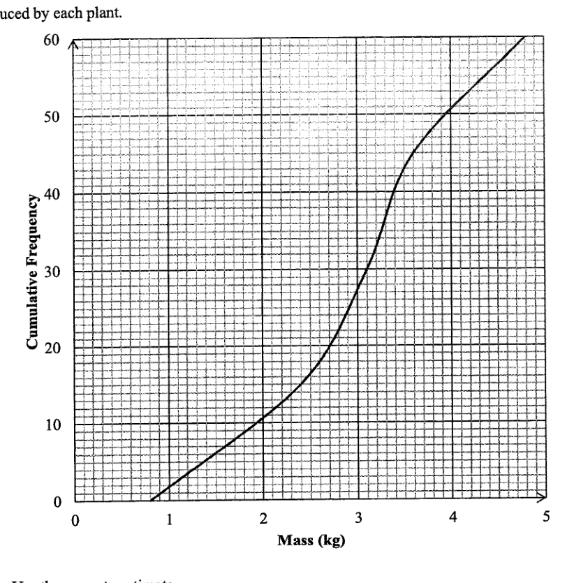
60 potato plants produce 5 to 10 potatoes each. The mass of potatoes produced by each plant were measured. The cumulative frequency curve below shows the distribution of the masses of the potatoes produced by each plant.
- ((i))
Use the curve to estimate
- ((a))
the median mass,
Answer ... kg
- ((b))
the interquartile range.
Answer ... kg
- ((a))
- ((ii))
It was stated that 20% of the potato plants were considered premium plants as they produced greater mass of potatoes.
Find the least mass of potatoes produced for the plant to be 'premium'.
Answer ... kg
- ((iii))
The potatoes produced by another group of 60 plants have the same median but smaller interquartile range.
Describe how the cumulative frequency curve will differ from the given curve.
Answer ...
...
It won't just hand you the answer — it asks where you're stuck.How the checker works
Worked solution
9((iii))
1. Relate the same median and smaller interquartile range to the shape of the cumulative frequency curve.
For plants, the median is read at cumulative frequency .
Same median: the new curve has the same mass value at cumulative frequency .
Smaller interquartile range: the mass difference between cumulative frequencies and is smaller, so the curve is more concentrated and steeper around the middle.
The new cumulative frequency curve passes through the same median point at cumulative frequency , but is steeper around the median, so that the horizontal distance between the points at cumulative frequencies and is smaller.
AI analysis — may contain mistakes.
Worked this one out on paper? Snap your steps and Gigle's AI math checker will circle the step where it went wrong.
More questions on this topic
- 1The masses of two batches of 400 steel bars produced by factory A and B were measured and recorded. The cumulative frequ…
- 2The diagram below shows the speed-time graph of a bus journey. The bus accelerated from rest at 1.25 m/s^2 to a speed of…
- 3The stem-and-leaf diagram shows the test scores of the boys and girls from a particular class. [Stem-and-leaf diagram pr…
- 4Explain how the line graph above may be misleading. Answer ...
- 5The graph shows the sales at a particular mall. Explain why the mean sales is not a good indication as a central measure…