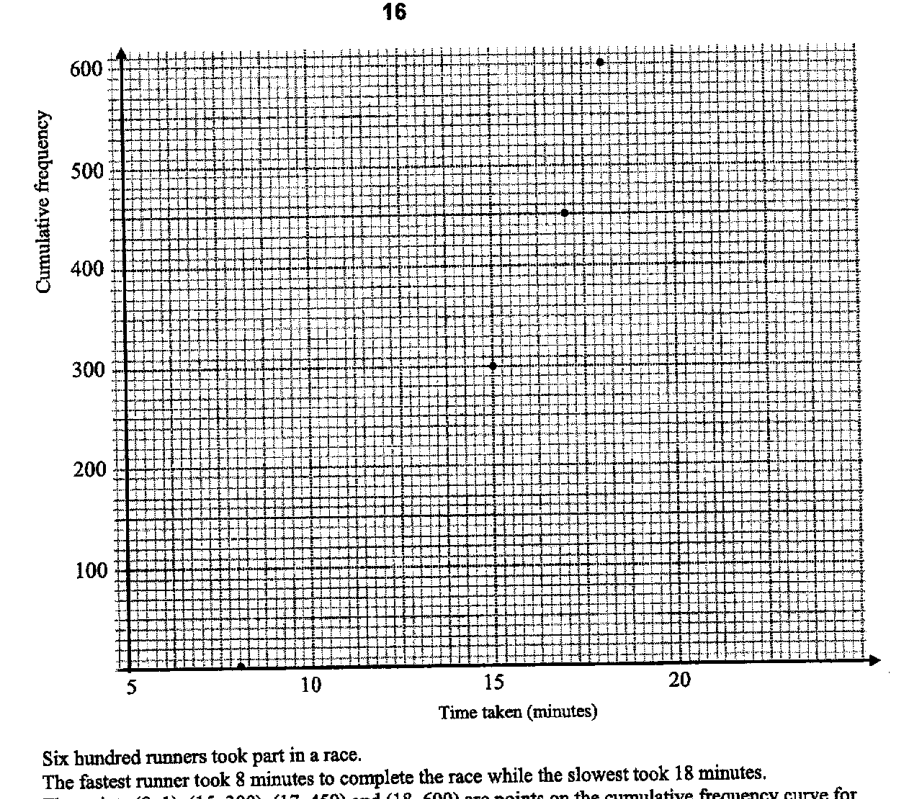
Six hundred runners took part in a race.
The fastest runner took 8 minutes to complete the race while the slowest took 18 minutes.
The points (8, 1), (15, 300), (17, 450) and (18, 600) are points on the cumulative frequency curve for the runners as shown on the grids above.
It is given that the interquartile time for the race is 4 minutes.
- ((i))
State the coordinates of the point that represents the lower quartile for the cumulative frequency curve.
Answer (___, ___)
- ((ii))
Draw the cumulative frequency curve on the grids above.
- ((iii))
"The bottom 10% runners have more consistent timings than the top 10% runners."
Do you agree with the statement above? Give your reasons clearly.Answer
It won't just hand you the answer — it asks where you're stuck.How the checker works
Worked solution
23((i))
1. Find the cumulative frequency corresponding to the lower quartile.
There are runners.
Lower quartile cumulative frequency:
2. Use the given interquartile time to find the lower quartile time.
The upper quartile has cumulative frequency
The point is given on the cumulative frequency curve, so
Given interquartile time is minutes,
Hence the lower quartile point is
23((ii))
1. Identify all points that the cumulative frequency curve must pass through.
From part (i), the lower quartile point is .
The given points are , , and .
So plot the points
2. Draw the cumulative frequency curve through the plotted points.
Join the plotted points with a smooth, non-decreasing curve.
The curve should start near the fastest time at minutes and rise to cumulative frequency at minutes.
A smooth increasing cumulative frequency curve passing through , , , and .
AI analysis — may contain mistakes.
Worked this one out on paper? Snap your steps and Gigle's AI math checker will circle the step where it went wrong.
More questions on this topic
- 1The masses of two batches of 400 steel bars produced by factory A and B were measured and recorded. The cumulative frequ…
- 2The stem-and-leaf diagram shows the test scores of the boys and girls from a particular class. [Stem-and-leaf diagram pr…
- 3The cumulative frequency graph shows distribution of the waiting times before being served, in minutes, of 60 customers…
- 4The waiting time, t in minutes, for 40 customers at two phone service shops, Shop A and Shop B, are as follows. Calculat…
- 5The temperatures of eighteen girls in a class on a particular day are shown in the stem-and-leaf diagram. (Stem-and-leaf…