The table shows the scores of 10 students in a Mathematics test.
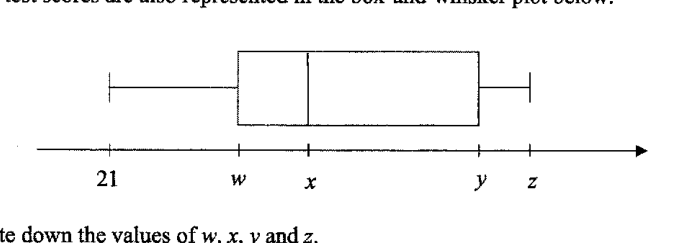
- (a)
Write down the values of w, x, y and z.
Answer w = ___
x = ___
y = ___
z = ___
- (b)
The temperature at Ang Mo Kio was recorded every day for 60 days.
The cumulative frequency graph below shows the distribution of the temperatures.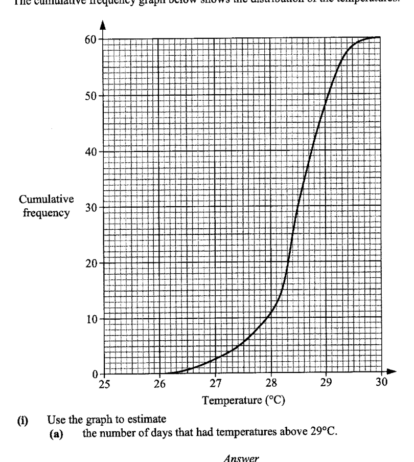
- (i)
Use the graph to estimate
- (a)
the number of days that had temperatures above 29°C.
Answer ___
- (b)
the interquartile range of the temperatures.
Answer ___
- (a)
- (ii)
The temperature at Jurong was recorded every day for the same period.
The interquartile range of the temperatures at Jurong is 1.5°C.
Explain what this tells us about the temperature at Jurong compared with the temperature at Ang Mo Kio.
- (i)
It won't just hand you the answer — it asks where you're stuck.How the checker works
Worked solution
23(a)
1. Write the data values in ascending order using the frequencies.
The 10 scores are
2. Find the quartiles, median and maximum from the ordered data.
For 10 values, the median is the average of the 5th and 6th values:
The lower half is , so
The upper half is , so
The maximum value is
AI analysis — may contain mistakes.
Worked this one out on paper? Snap your steps and Gigle's AI math checker will circle the step where it went wrong.
More questions on this topic
- 1The masses of two batches of 400 steel bars produced by factory A and B were measured and recorded. The cumulative frequ…
- 2The stem-and-leaf diagram shows the test scores of the boys and girls from a particular class. [Stem-and-leaf diagram pr…
- 3The cumulative frequency graph shows distribution of the waiting times before being served, in minutes, of 60 customers…
- 4The waiting time, t in minutes, for 40 customers at two phone service shops, Shop A and Shop B, are as follows. Calculat…
- 5The temperatures of eighteen girls in a class on a particular day are shown in the stem-and-leaf diagram. (Stem-and-leaf…