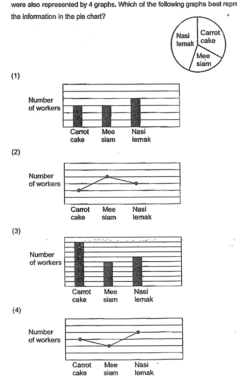
A group of workers was asked to vote for their favourite food, carrot cake, mee siam and nasi lemak. The pie chart shows the workers' choices. The workers' choices were also represented by 4 graphs. Which of the following graphs best represents the information in the pie chart?
It won't just hand you the answer — it asks where you're stuck.How the checker works
Worked solution
10
1. Determine the relative sizes of the sectors in the pie chart
From the pie chart, the sizes of the sectors are in the order: Nasi lemak > Carrot cake > Mee siam.
2. Evaluate the given graphs against the relative sizes
Graph (1): Carrot cake = Mee siam (Incorrect)
Graph (2): Mee siam > Nasi lemak (Incorrect)
Graph (3): Carrot cake > Nasi lemak (Incorrect)
Graph (4): Nasi lemak (3) > Carrot cake (2) > Mee siam (1) (Correct)
Answer
Graph (4) (option 4)
AI analysis — may contain mistakes.
Worked this one out on paper? Snap your steps and Gigle's AI math checker will circle the step where it went wrong.
More questions on this topic
- 1数学考试甲、乙两名同学的平均分是88分,甲、丙两名同学的平均分是90,乙、丙两名同学的平均分是92,他们三人的平均分是多少分?
- 2刘华参加演讲比赛,个评委的打分分别是:分、分、分、分、分、分、分。如果去掉一个最高分和一个最低分,刘华的平均得分是多少分?
- 3Danny's scores for 5 games are shown in the table below. | Game | 1st | 2nd | 3rd | 4th | 5th | | :--- | :---: | :---: |…
- 4A group of students had an average of $10. Three students with a sum of $57 joined the group and the average amount of…
- 5小华三次口算分别算对了题、题、题.平均每次算对了 ___ 题.