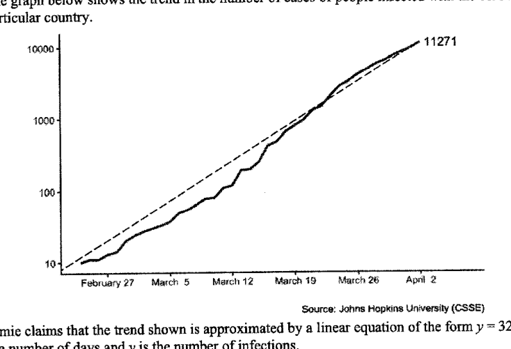
下图显示了某国新型冠状病毒感染人数的变化趋势。 杰米声称,图中的趋势可以用形如 的线性方程来近似,其中 是天数, 是感染人数。 解释为什么她是错的。
它不会直接告诉你答案,而是问你卡在哪一步看看 AI 是怎么陪你一步步弄懂这道题的
完整解法
6
1. Identify why the graph does not support the stated linear model
The vertical axis is not a normal linear scale, since are equally spaced. It is a logarithmic scale. Therefore, the dashed straight line on the graph is not evidence that is directly proportional to , so the trend cannot be approximated by from this graph.
答案
Jamie is wrong because the vertical axis is on a logarithmic scale: the labels are equally spaced. Hence a straight line on this graph does not represent a linear relationship in the actual number of infections.
AI 分析,可能出错
用 AI 批改,圈出写错的那一步,并自动将你的薄弱点存入错题本,形成你的错因库。
同一知识点的其他题
- 1解释上面的折线图可能如何产生误导。 答案 ...
- 2下面是来自《2023年新加坡年度气候报告》的一张图表,显示了自1929年以来新加坡最热的10个年份。 指出该图表中可能具有误导性的一个方面,并解释这如何可能导致对图表的误读。 ...
- 3某网站展示了一幅关于非洲象偷猎统计数据的海报。 解释上述海报可能具有误导性的原因。
- 4该图表显示了 2017 年至 2019 年年度自行车马拉松赛中的骑行人数。 指出该图表中可能具有误导性的一个方面。 解释这可能会如何导致对图表的误解。
- 5一家公司在这张图表中展示了他们 2023 年的财务报告。 指出图表中可能产生误导的一个方面,并解释这可能会如何导致误解。 答案 ...